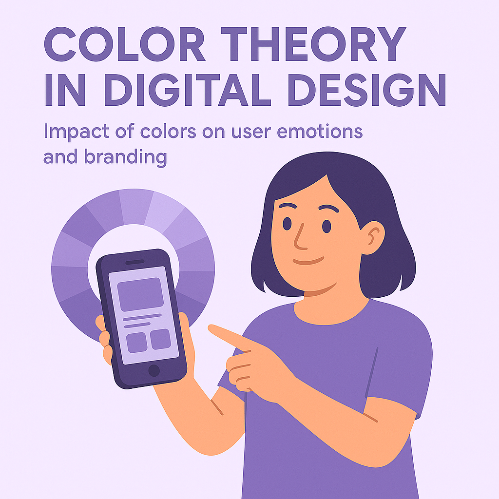
Color is one of the most powerful tools in a designer's toolkit. It can influence mood, direct attention, establish hierarchy, and communicate brand values—all without a single word.
The Psychology of Color
Colors evoke emotional and psychological responses that can significantly impact user experience:
- Red: Energy, passion, urgency, attention-grabbing
- Blue: Trust, security, calmness, professionalism
- Green: Growth, health, wealth, environmental themes
- Yellow: Optimism, clarity, warmth, caution
- Purple: Creativity, luxury, wisdom, spirituality
- Orange: Enthusiasm, playfulness, affordability
- Black: Sophistication, luxury, power, elegance
- White: Simplicity, cleanliness, purity, space
Color Harmony in UI Design
Creating effective color schemes involves understanding color relationships:
1. Monochromatic
Using different shades and tints of a single color creates a cohesive, harmonious look. This approach is elegant but can sometimes lack visual interest.
2. Analogous
Colors that sit next to each other on the color wheel (like blue, blue-green, and green) create a serene, comfortable feeling. This scheme works well for creating a unified experience.
3. Complementary
Colors opposite each other on the color wheel (like blue and orange) create high contrast and visual vibrance. Use complementary colors when you want elements to stand out.
4. Triadic
Three colors equally spaced around the color wheel offer strong visual contrast while maintaining harmony. This scheme provides rich visual interest even with muted colors.
Accessibility Considerations
Color choices must account for users with visual impairments:
- Maintain a minimum contrast ratio of 4.5:1 for normal text and 3:1 for large text
- Never rely solely on color to convey information
- Test designs with color blindness simulators
- Consider offering high-contrast modes
Cultural Context
Color meanings vary across cultures. For example:
- White symbolizes purity in Western cultures but can represent mourning in some Eastern cultures
- Red signifies luck and prosperity in Chinese culture but can represent danger in Western contexts
- Purple has royal associations in many Western cultures but can have different connotations elsewhere
Practical Application: Creating a Color System
A systematic approach to color in digital products includes:
- Primary colors: Brand colors that define your visual identity
- Secondary colors: Complementary colors that provide contrast and emphasis
- Neutral colors: Grays and muted tones for text, backgrounds, and supporting elements
- Semantic colors: Colors that convey meaning (success, error, warning, info)
- Dark/light mode variants: Adaptations for different viewing conditions
Remember that effective color use in digital design balances aesthetic appeal with functional clarity and accessibility. The best color choices are those that support your users' goals while reinforcing your brand identity.